Top 10 Website Design Trends for 2026
In 2026, website design is shifting from “looks good” to “works well, reads clearly, and converts.” Most visitors arrive with practical questions: How much will it cost? How long will it take? Can I see examples? If your page is slow, confusing, or makes people dig for answers, they will leave quickly. At the same time, AI makes it easier to update and adjust content—but it also raises the bar for trust and credibility. These trends apply to company websites, international / multilingual sites, and booking-based local service websites. Below are 10 trends explained in simple language, with practical tips you can implement right away.
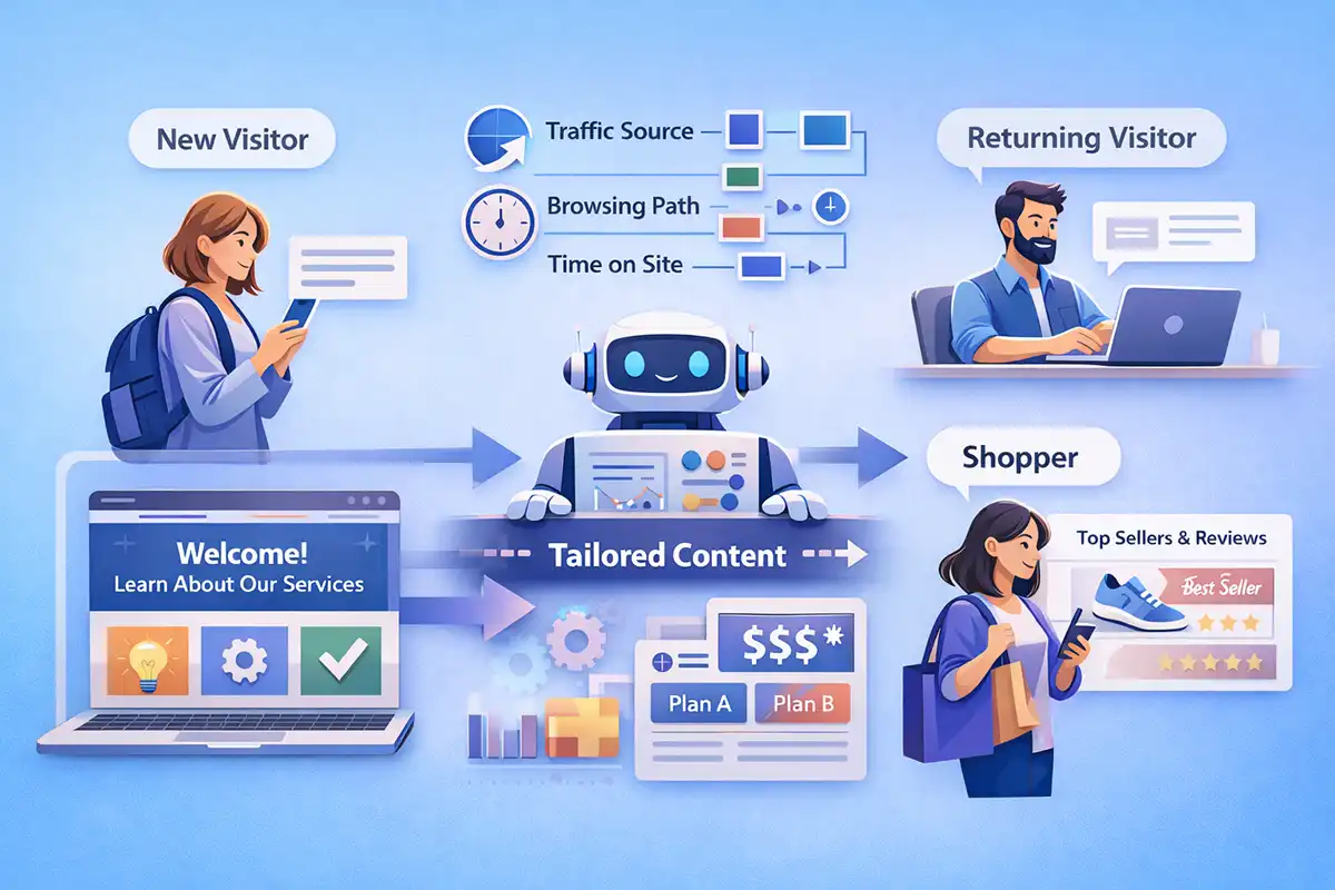
1) Show Different Priorities to Different Visitors
More websites are moving away from “one page for everyone.” In 2026, it’s increasingly common to adjust what people see based on where they came from, what they clicked, and how long they stayed. New visitors should quickly understand what you do; returning visitors should find it easier to reach pricing, booking, or comparisons. A local service business can show phone and availability first, while an online store can highlight best-sellers and real reviews first. You don’t need a complicated system to start—often it’s enough to create two or three content orders and test them. The goal is not to show more, but to show what matters most at that moment.
2) AI Moves from “Writing Text” to “Improving Pages”
Many teams already use AI to write headlines and adjust tone. In 2026, a more common use is letting AI help you improve the page itself: where the text is too long, what is unclear, which button is not “obviously the next step,” and how to rewrite sections in multiple ways. Then you compare results and keep what works best. Think of AI as a careful editor: it does not replace your strategy, but it can speed up clearer messaging. Start with a small round of improvements on your homepage, service page, and form page—these are often the fastest places to increase inquiries.
3) “Making People Feel Safe” Becomes Part of Design
When your site uses smart chat, automatic suggestions, or quick estimates, users often worry: “Why is it saying that?” That’s why more pages will include simple explanations—what the result is based on, where the data comes from, and how to correct or turn it off. You can keep it light: one short note under the result, a “Learn more” link near the button, and a human contact method as a backup. For example, next to an estimate you can write: “Based on the size and service area you entered; final pricing will be confirmed by our team.” These small details reduce doubt—especially for high-value services, B2B leads, or forms that require uploading information.
4) Accessibility and Readability Become Basic Standards
Bigger text, clearer headings, better contrast, and menus that work with a keyboard help more people use your site—and they also help search systems understand your content. Don’t overthink it: keep one main title per page; avoid very long paragraphs; add a short description for images; and make form error messages specific (not just “Error,” but “What is wrong and how to fix it”). Also, don’t rely on color alone to show status—add an icon or text so it is still clear. If your page can be understood in one quick scan, it will feel more professional.
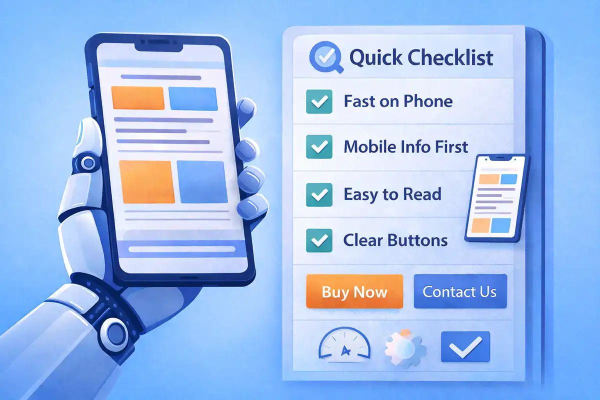
5) Speed Keeps Defining First Impressions
In 2026, more users browse on mobile with mixed network conditions. If a page is slow by a few seconds, it may be closed. This pushes design to be more focused: fewer heavy background videos, fewer oversized sliders, lighter animations, and smarter image loading. Content also needs to answer questions sooner—put pricing range, timeline, service area, and key benefits near the top so people don’t scroll forever. A simple test is to open your site on your phone using different networks and experience it as a real customer. When speed improves, your site usually looks cleaner and more trustworthy too.
6) More Modular Layouts: Build Pages Like Blocks
More websites organize information in “blocks” or “cards”: services, pricing, case studies, reviews, and FAQs can each live as separate modules. On mobile, they stack; on desktop, they can sit side by side. The benefit is flexibility: adding a new service or campaign often means swapping a few blocks, not rebuilding the whole page. It also makes teamwork easier—one person updates case studies, another updates reviews, another updates FAQs. For bilingual sites, modular content is even more helpful: you translate and maintain block by block, which lowers the long-term workload.
Image (Insert here): Bento / card layout
7) Fewer Animations, but More Useful Interactions
Animations are increasingly treated as tools, not decoration. In 2026, the best motion helps people understand and act: clear feedback when hovering or tapping buttons, instant hints while filling forms, and strong confirmation after submitting (received, expected response time, next step). On long pages, subtle reveals can guide attention to key sections—but excessive “flying” effects can distract and slow things down. Even a simple loading message is better than a blank screen. Treat motion like a signal light, not fireworks: quiet, helpful, and never in the way.
8) Typography and Layout Become the Main “Visual Style”
More brands rely less on huge images and more on strong typography: clear headline rhythm, comfortable spacing, and a consistent structure that reads well on mobile. This makes pages lighter, easier to scan, and easier to remember. Practical steps: keep headlines short; add a subheadline that states what the visitor gets; keep paragraphs within 3–5 lines; use lists when needed; and highlight only truly important sentences (not everything). A consistent size-and-spacing system across the site makes everything feel more “designed” without needing fancy effects.
9) Two Style Directions: Calm Minimal vs. Bold Personality
Design style is becoming more “two-lane.” One direction is calmer and cleaner: more whitespace, fewer colors, fewer distractions—great for finance, professional services, and B2B where trust matters most. The other direction is more expressive: retro looks, hand-drawn elements, bold contrast, and strong character—great for restaurants, lifestyle brands, and creative studios that need to stand out. Either way, the basics must stay solid: clear navigation, obvious buttons, and important info not hidden too deep. If you’re unsure, start clean and add personality in a few key areas. Your style can be bold, but the path must be simple.
10) More “Texture” and Depth—Used Carefully
Frosted layers, soft shadows, and gentle depth are returning because they help people understand what is clickable and what sits on top. The most practical approach is to focus these effects on key areas: navigation, cards, buttons, and pop-ups—so users quickly see “where to click” and “what will happen next.” A button that slightly changes when pressed feels like a real control and builds confidence. The key is restraint: too many layers can make a page feel busy and may slow it down. If the important actions are clearer, the site feels more refined without being heavy.
Final Thoughts
In summary, website design in 2026 is not about being “cooler”—it’s about being clearer, faster, and more trustworthy. When writing or redesigning, ask four questions: Can visitors understand what I do within 10 seconds? Is the next step obvious? Is it comfortable to read on mobile? Is it slow because of heavy images or effects? Build the basics first, then add personalization and refined visual details over time. When your content and layout focus on real visitor questions, your website design becomes like a reliable salesperson and support agent: less noise, more help—so people keep moving forward and are more likely to contact you or buy.